Hello, friends! It’s Julia from Bayhill Studio. Today I’m excited to share my newest “Great Granny Square” quilt pattern featuring fabric from the In the Afterglow collection designed by Minki Kim.
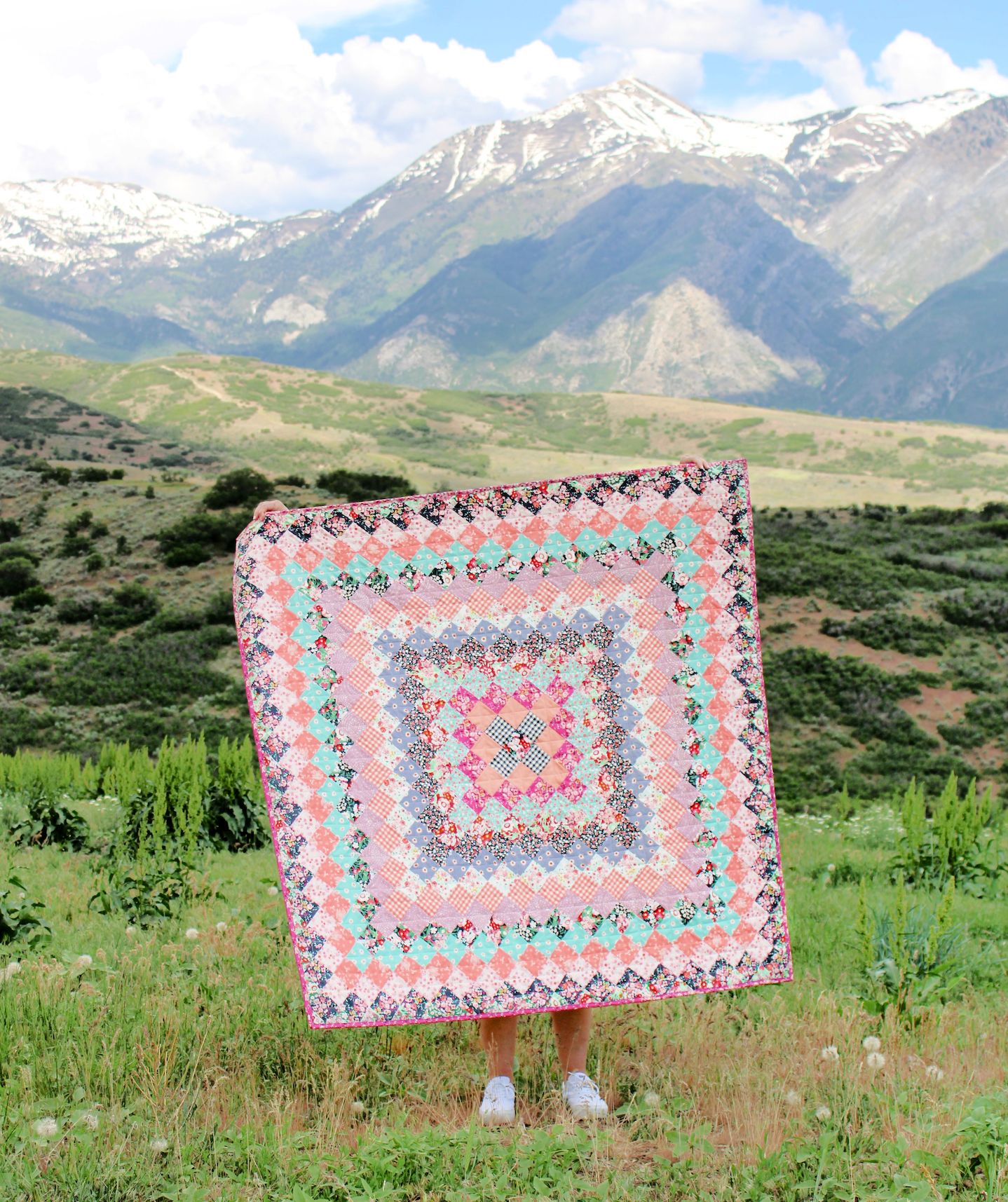
The quilt takes a traditional granny square block, and keeps it going for a combination of a trip around the world block and a granny square block. The finished look is both contemporary and timeless.
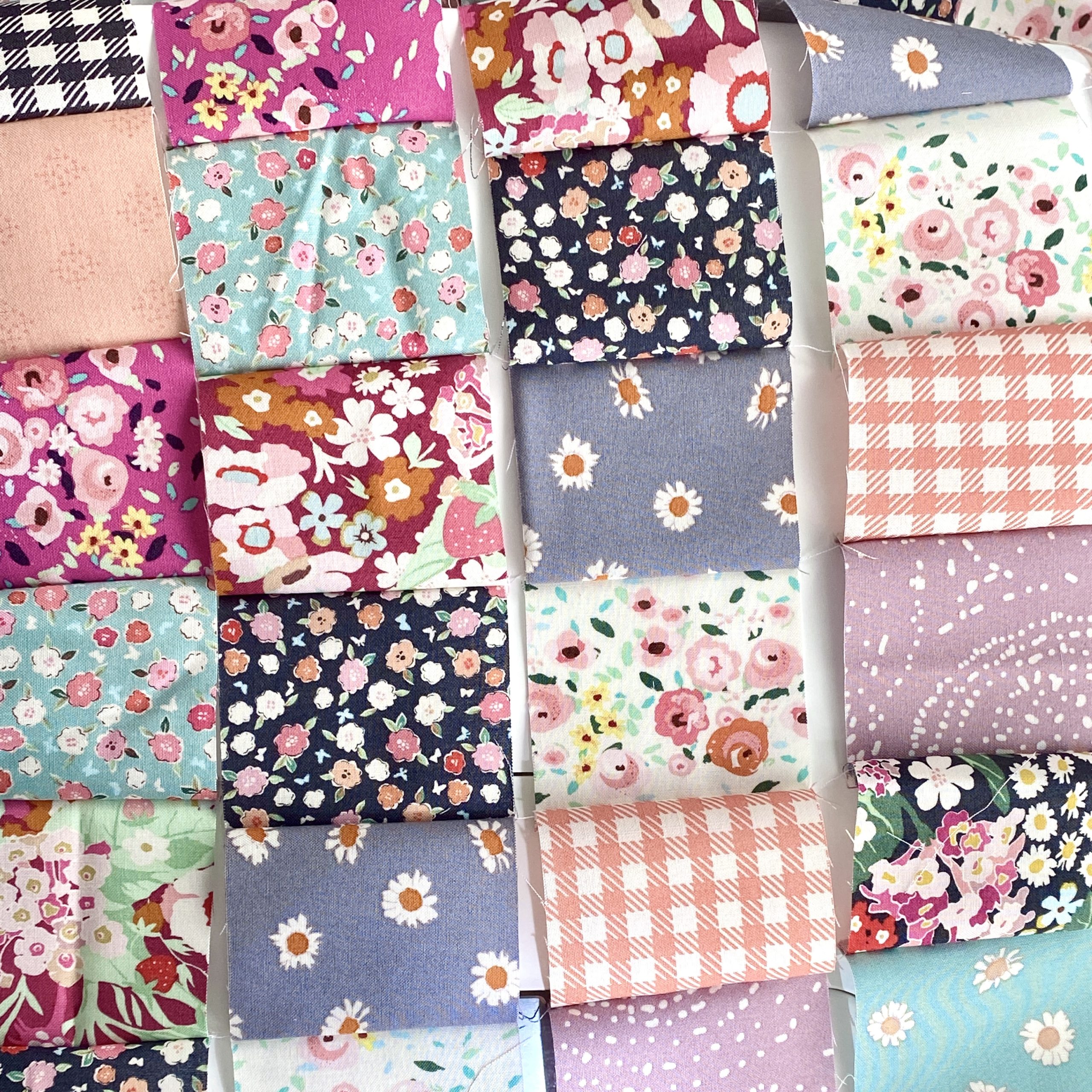
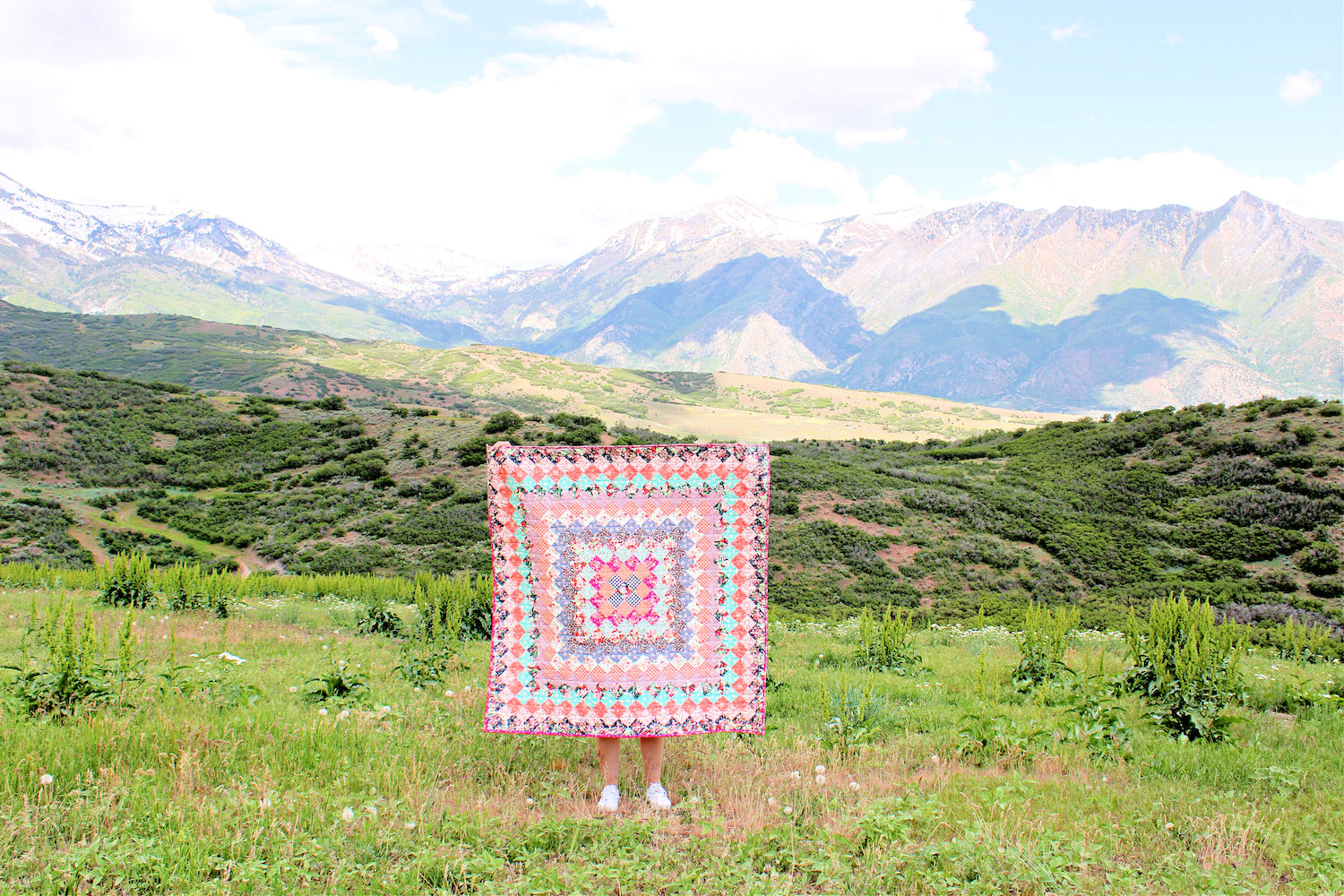
The fabric I used for this quilt comes from the In the Afterglow collection designed by Minki Kim for Riley Blake Designs. Minki designed a charming mix of florals with a dreamy color palette, and I knew it would be absolutely perfect for this quilt.
The Great Granny Square Quilt can be assembled using various chain piecing techniques, or just one row at a time. I love when there are a variety of options, so each quilter can do what works best for them.
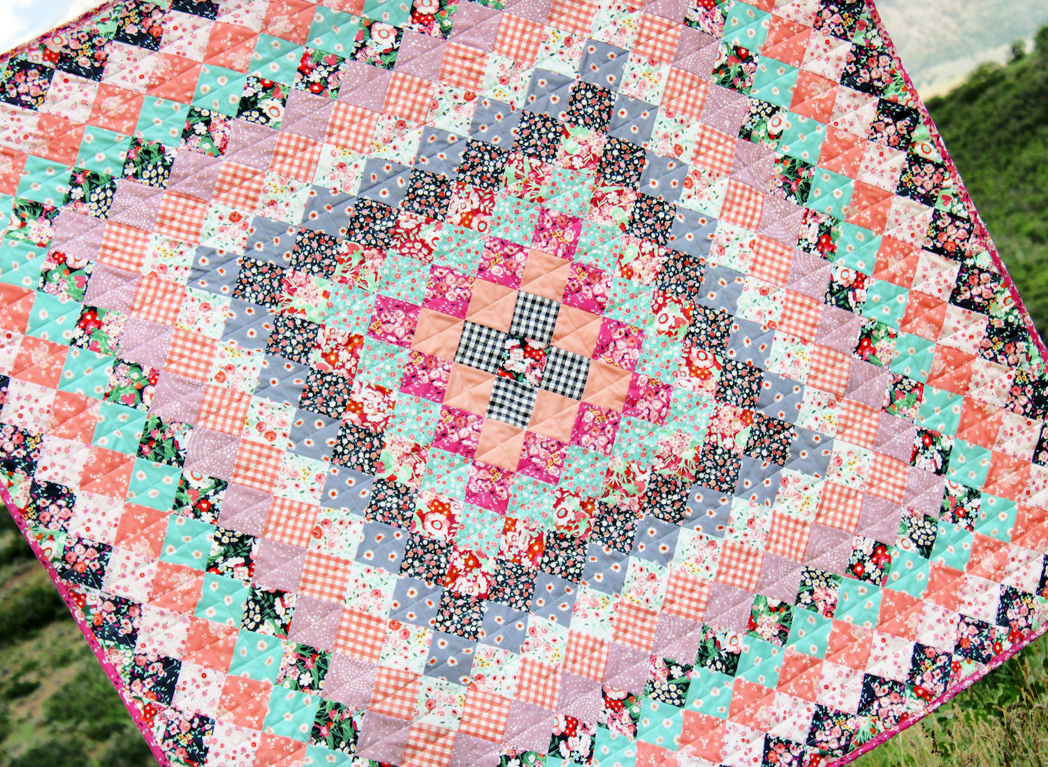
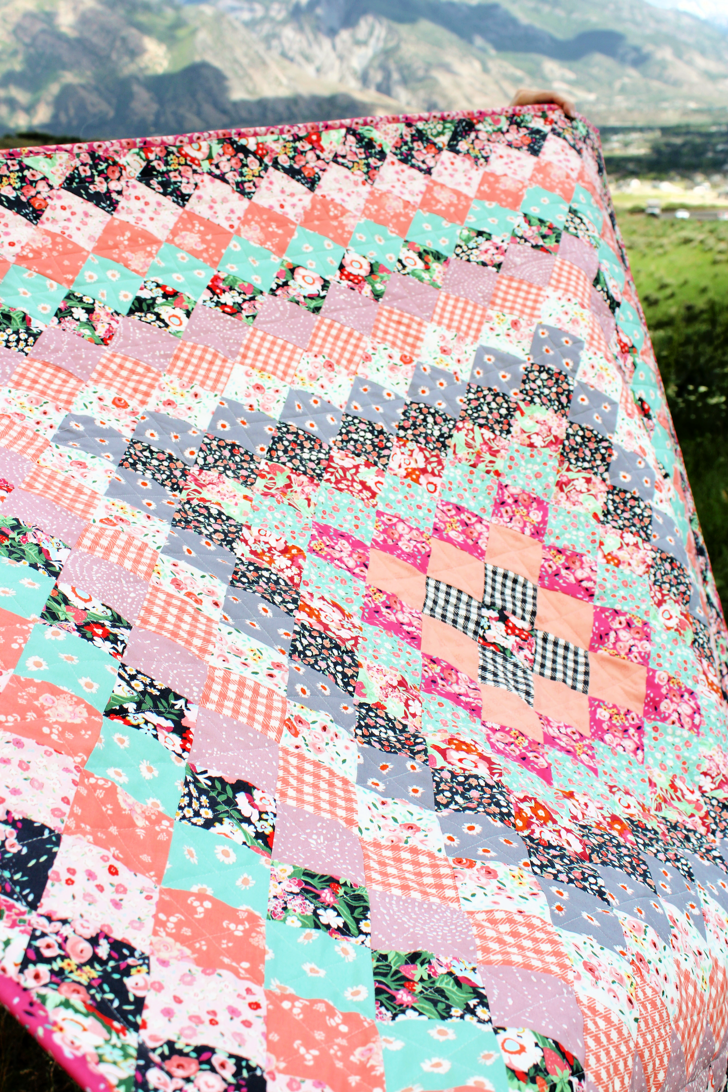
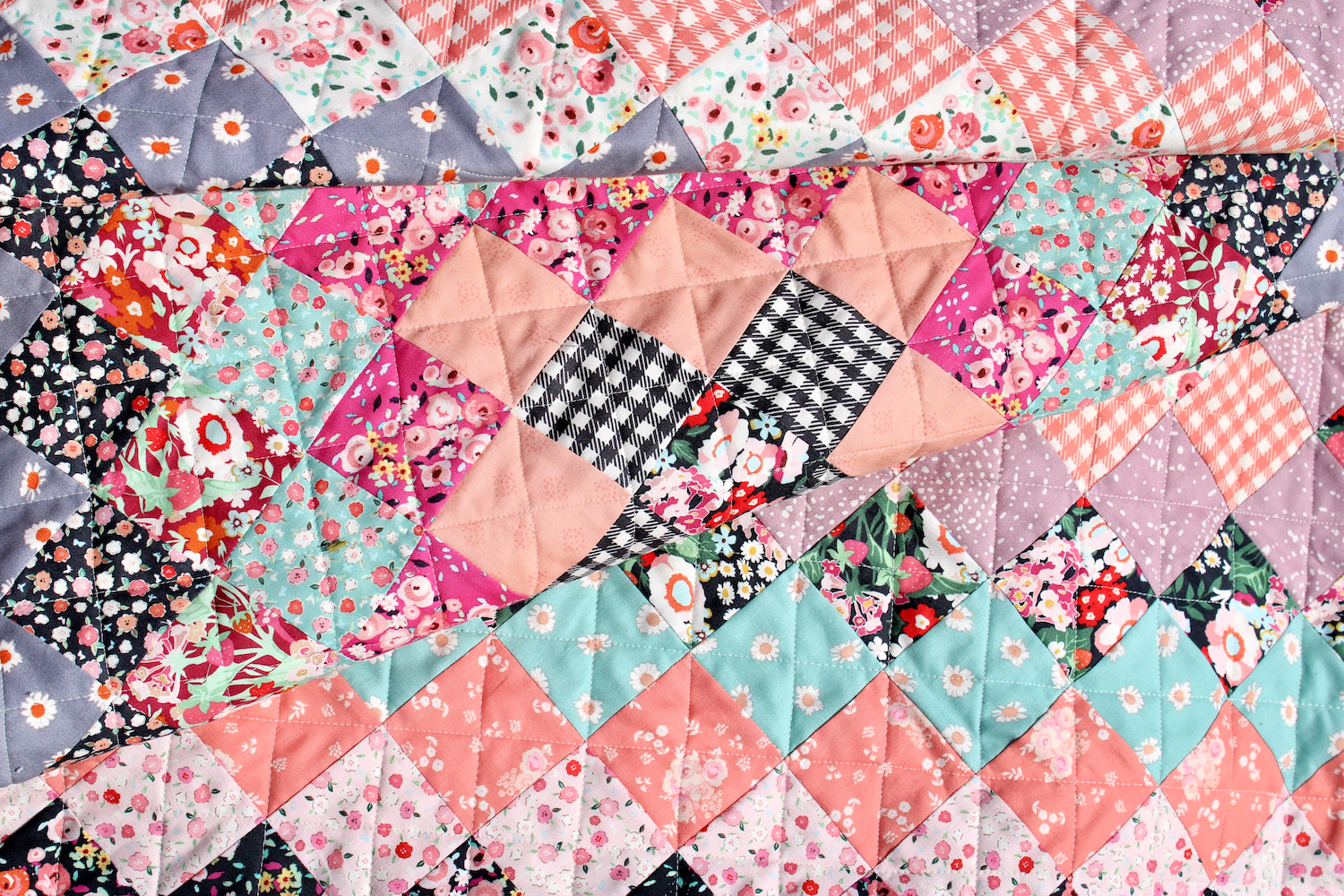
I was so happy when I saw that Minki had designed several prints with a black background. Having one fabric with a strong contrasting color is what I think makes this quilt really pop. Notice I placed a black print at the center, then a few rows out from the center, and again a few rows after that, and finally one more layer of black fabric at the end. This contrasting color helps create “frames” that give the eye a place to rest as well as a unifying theme. It doesn’t have to be a black print. Any contrasting color will do. For example, if most of my fabrics were darker, a light colored fabric would also provide contrast.
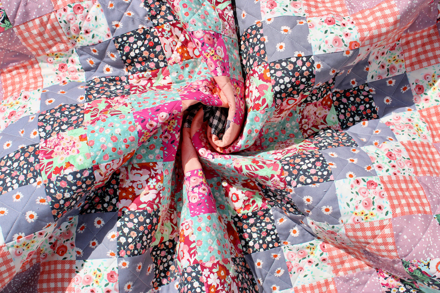
I was also intentional about arranging my fabrics so they varied in scale and color. There is no exact science to this — in fact, sometimes I wanted contrasting colored squares next to each other, and other times I wanted similar values next to each other. More important than color, for me, was scale. I was careful not to put small scale prints next to other small scale prints, and visa versa. Here you can see some of the contrasting scale and color — large scale next to small scale. Mint next to pink, purple next to off white, etc.
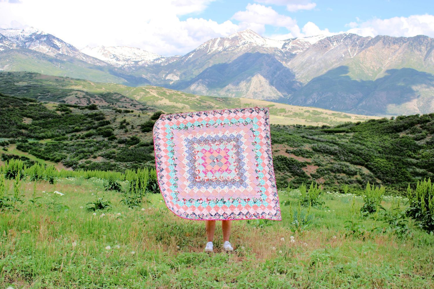
Stepping back, you can see how all of these decisions impact the overall look of the quilt.
I wanted to keep the quilting fairly loose, so that after it is washed, the quilt becomes soft and cuddly. To do this, I opted for simple straight lines going through the diagonal points — horizontally and vertically.
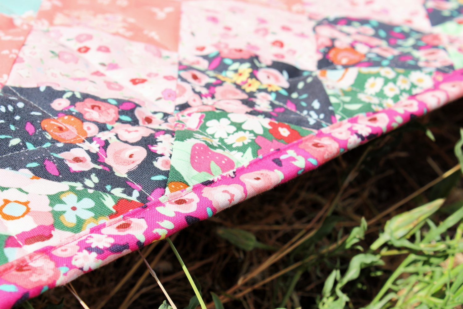
I love the little pop of fuscia pink at the center of the quilt, so I decided to repeat it one more time in the binding. I love how it frames the quilt and the busy boho vibe it adds.
You can get your Great Granny Square Quilt Pattern in my shop, or by clicking the link above. Tag me on Instagram @bayhillstudio with your finished quilt picks. I can’t wait to see them! Be sure to follow me on Instagram and subscribe to my YouTube Channel for more creative content and project ideas. Have a blessed day!